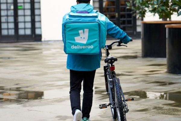
Deliveroo is to undergo a major re-branding that will see an update of its kangaroo logo (pictured) and a new brightly coloured hyper-reflective kit for its delivery riders.
The company's design team collaborated with road safety organisation Brake, saying it "wanted to give our riders [a] kit they’d be proud to wear, that enhanced their visibility and safety both day and night". The team put Deliveroo's distinctive kangaroo logo went through a full semiotics analysis, looking at what it meant in other cultures and countries, turning the kangaroo into "into a striking new mark, bold and impactful, but still maintaining the character and charm of the Roo".
Its new riders uniform was designed to "amp up the colours in our kit for the day" and to help those in warmer/colder climates. The finished product is described as having "a photography style that could hero food in all its juicy, oozy, real-life detail, with hyper-real colours, textures and mouthwatering clarity, this style of art direction showed the messiness of food in its tangible, upclose glory."
Deliveroo's Head of Procurement company, Kat, tested the changes and its waterproof effectiveness with a 180-kilometre cycle through the Scottish highlands. It's hoped that thew new art direction and logo will "put food and our restaurants in the spotlight, and we hope [it] becomes a shorthand for great food delivered anywhere".